How to add images to WordPress without slowing down your website
Prerequisites
- WordPress
Overview
Photos straight off a phone, a camera or a designer’s export are usually four to six thousand pixels wide and several megabytes each, and nothing on a website ever needs that. Resize the image on your own computer before you upload it: about 2000 pixels wide for a full-width banner, about 1200 for a photo inside a page, and the exact size it appears at for a logo. Save photos as JPEG and flat graphics as PNG, then write a short line of alt text describing what the image shows. WordPress does help, but only partly. It makes smaller copies of every image you upload and hands the right one to each visitor, and it caps anything over 2560 pixels wide. It does not throw away your oversized original, and it cannot rescue a file that was saved badly in the first place. On our test the same photograph, uploaded once at 6000 pixels and once resized to 1600, made the difference between a page weighing 964 KB and one weighing 708 KB, and between 6.6 seconds and 5.2 seconds to finish loading on a mobile connection. The whole job takes about a minute per image once you have done it twice.
Check how big the image is before you do anything with it#
Two numbers decide whether an image will slow your website down, and both of them are visible before you go anywhere near WordPress. The first is how many pixels wide it is. The second is the file size in megabytes. A photo from a phone or a camera is usually somewhere between 3000 and 6000 pixels wide and between two and eight megabytes, and a designer’s export can be larger still.
On a Mac, find the file, hold Control and click it, choose Get Info, and read the Dimensions and Size lines. On Windows, right-click the file, choose Properties, then the Details tab, and read Dimensions and Size. You are looking for two things: a width over about 2500 pixels, and a size over about half a megabyte. Either one on its own means the file is bigger than your website needs.
It is worth doing this for the file you are about to upload rather than trusting how it looks on screen. A photo that fills a quarter of your laptop screen in Preview can still be 6000 pixels wide, because your computer is quietly shrinking it to fit the window. The file on disk has not changed.
Work out how wide the image actually needs to be#
This is the number that does most of the work, and it is smaller than people expect. The rule of thumb is roughly twice the width of the space the image sits in. The doubling is there for high-resolution screens, which draw two screen pixels for every one the page asks for. Past that point the extra pixels get downloaded and thrown away.
A banner running the full width of a wide screen is the one place where that rule would give you a silly number, so it gets a fixed answer instead. These are the widths worth working to on a normal website, and they are deliberately generous so you do not have to think about it again.
| What it is | Width to save it at | Rough file size to aim for |
|---|---|---|
| Full-width banner across the top of a page | 2000 px | 200 to 400 KB |
| A photo inside the body of a page | 1200 px | 100 to 250 KB |
| A photo in a column, a card or a team grid | 800 px | 60 to 150 KB |
| A logo in the header | Twice the size it appears at, so usually 400 to 600 px | Under 50 KB |
| An icon or a small badge | Twice the size it appears at, so usually 100 to 200 px | Under 20 KB |
Height does not matter, only width. Set the width and let the height follow, so the photo does not end up squashed. If you are unsure which row applies, 1600 pixels wide is a safe middle answer for almost any photo on almost any page.
Resize the image on your computer before you upload it#
This is the step that saves the megabytes, and it takes about twenty seconds once you know where the box is. Any of these will do the job, and none of them costs anything.
- On a Mac, open the photo in Preview, then Tools, then Adjust Size. Type your width into the Width box, make sure “Scale proportionally” is ticked, click OK, then File, then Export, and drag the Quality slider to about three quarters. Save it under a new name so you keep the original.
- On Windows, open the photo in the Photos app, click the three dots, then Resize image. Choose Define custom dimensions, type your width, and save a copy.
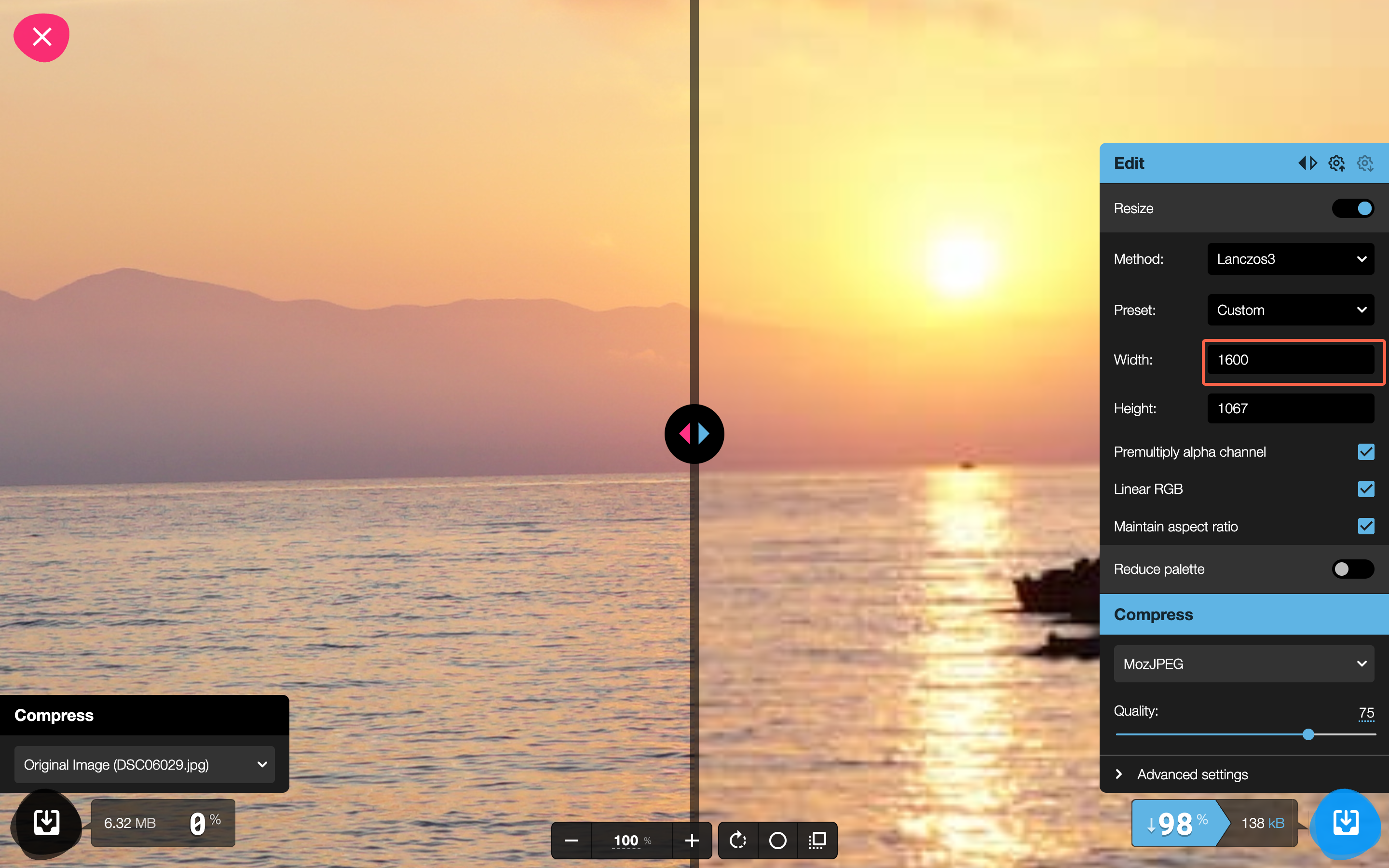
- In any browser, go to squoosh.app, drag the photo onto the page, tick Resize on the right, and type your width into the Width box. It shows you the new file size as you go and you download the result. Your photo never leaves your computer.
Below is the browser option with a 6000 pixel photo being brought down to 1600. The panel on the right is where the width goes. Squoosh reports the saving as you change it, which is a useful sanity check: in this case a 6.32 MB photo came out at 138 kB. The exact figure depends on the quality setting, and anything in the low hundreds of kilobytes for a full-width photo is fine.
Whatever you use, always save the resized version as a new file and keep the original somewhere. You will want the full-size photo again one day, for print or for a different crop, and you cannot get the detail back once it has gone.
Save photos as JPEG and flat graphics as PNG#
Format matters almost as much as size, and picking the wrong one is expensive. The same 1600 pixel photograph came out at 201 KB as a JPEG and 2.02 MB as a PNG. That is ten times the weight for a picture nobody could tell apart.
- JPEG for anything photographic. People, places, products, food, interiors. This is the right answer nine times out of ten.
- PNG for flat graphics with hard edges or a see-through background. Logos, diagrams, screenshots, charts. PNG is the wrong choice for a photo and the right choice for a logo that has to sit on a coloured background.
- WebP is a newer format that produces a smaller file than JPEG at the same quality, and WordPress accepts it. It is worth using if your resizing tool offers it, but it is not worth going out of your way for. The same photo above was 201 KB as a JPEG and 135 KB as a WebP.
- SVG is the ideal format for a logo, because it stays sharp at any size and the file is tiny. WordPress will not accept one by default and will tell you “Sorry, you are not allowed to upload this file type”. That block is deliberate, because SVG files can carry code inside them. Send the SVG to whoever looks after your website rather than looking for a way around it.
One more, because it catches iPhone users. Photos taken on a recent iPhone are often HEIC files rather than JPEGs. Depending on how your website’s server is set up, WordPress will either quietly convert a HEIC to a JPEG for you, or accept the file and then be unable to display it, leaving a blank space on the page. You cannot tell which from the outside, so convert it yourself first. On a Mac, opening it in Preview and choosing File, then Export, then JPEG does it. On an iPhone, Settings, then Camera, then Formats, then Most Compatible makes every future photo a JPEG.
Upload the image and check what WordPress did with it#
In the left menu, hover Media and click Add Media File, then drag your resized file onto the page. Once it has finished, click the image to open Attachment details. This is worth looking at once, because it tells you exactly what WordPress does for you and what it does not.
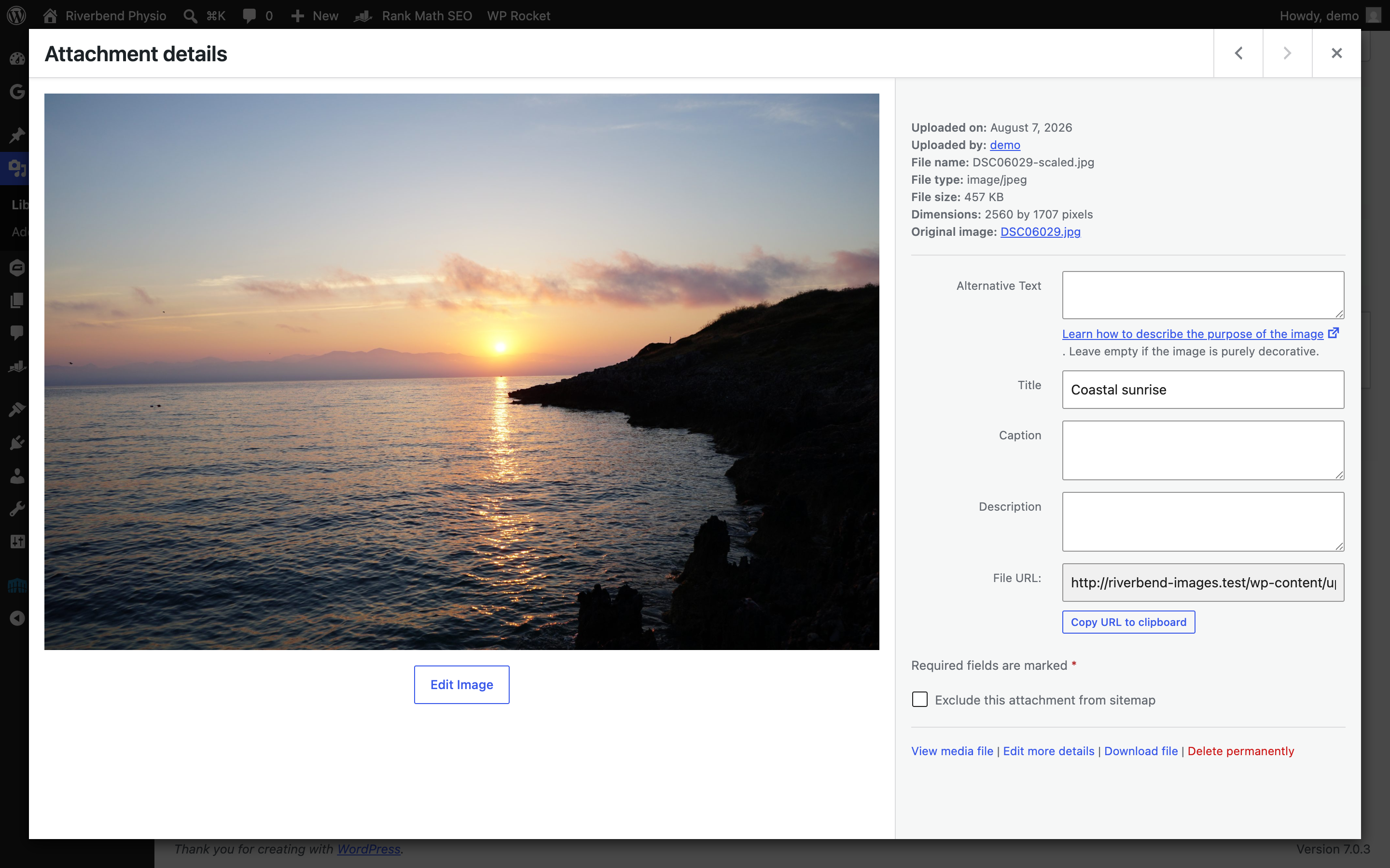
What WordPress does on its own: it makes five or six smaller copies of every image at fixed widths, and it hands each visitor whichever copy suits their screen, so somebody on a phone is not sent your desktop banner. It also caps anything wider than 2560 pixels. The screenshot above is a 6000 pixel photo, and the Dimensions line reads 2560 by 1707 because WordPress made a capped copy and is using that instead.
What it does not do is more important. It keeps your original untouched, forever, which is the “Original image” link in that panel. It does not compress anything harder than you already have, so a badly saved file stays badly saved. And 2560 pixels is still well over what any page needs, so the cap is a safety net, not a fix. In our test the 6000 pixel upload left 7.5 MB of files on the server across eight copies. The same photograph resized to 1600 first left 0.55 MB across six. That is roughly fourteen times the storage, and it is in every backup of your website from now on.
Write the alt text while the image is still in front of you#
Alt text is the sentence that describes an image to somebody who cannot see it. Screen readers read it aloud, it appears if the image fails to load, and search engines use it to work out what the picture is. It takes about ten seconds and it is the single easiest accessibility improvement on any website. The box is on the Attachment details panel you already have open, and it saves as you type.
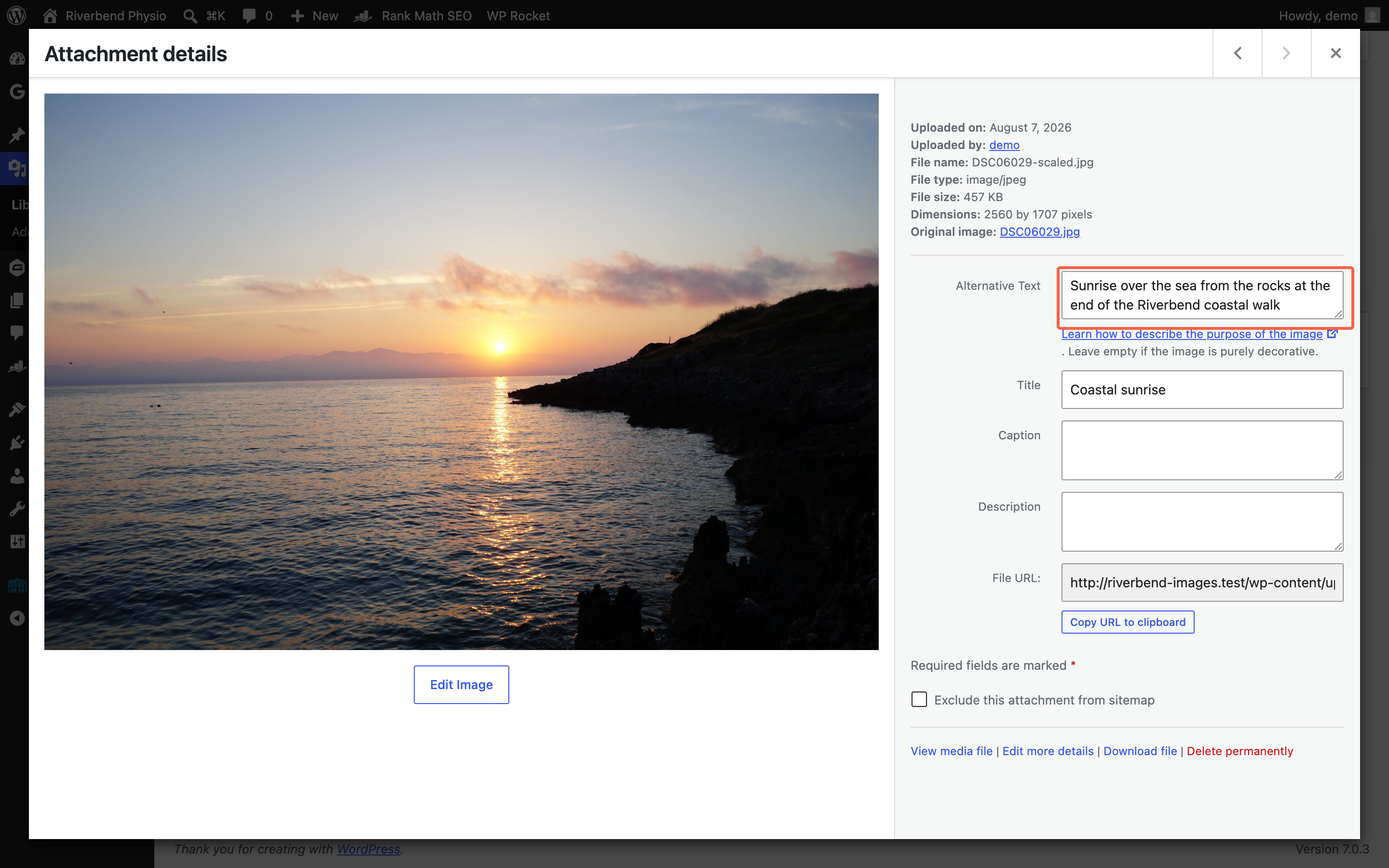
Describe what is in the picture, in a normal sentence, as though you were telling someone over the phone. Aim for somewhere between five and fifteen words. “Sunrise over the sea from the rocks at the end of the Riverbend coastal walk” is right. “Image” and “DSC06029” are useless. “physio physiotherapy Riverbend physio near me best physio” is worse than useless, because search engines treat stuffed alt text as spam and a screen reader will read every word of it aloud.
There is one case where the right answer is to write nothing. If the image is purely decorative, a background texture, a divider, a flourish that carries no information, leave the box empty. An empty box tells assistive software to skip it, which is exactly what you want. WordPress says as much under the field: “Leave empty if the image is purely decorative.” Empty on purpose is correct. Empty because you forgot is the problem.
Insert the image on the page at the right size#
Doing everything above and then inserting the image at full size undoes a good part of it. Open the page, add an Image block, choose your image from the Media Library, then click the image once so it is selected. In the panel on the right, open the Block tab and click the cog icon. The control you want is called Resolution.
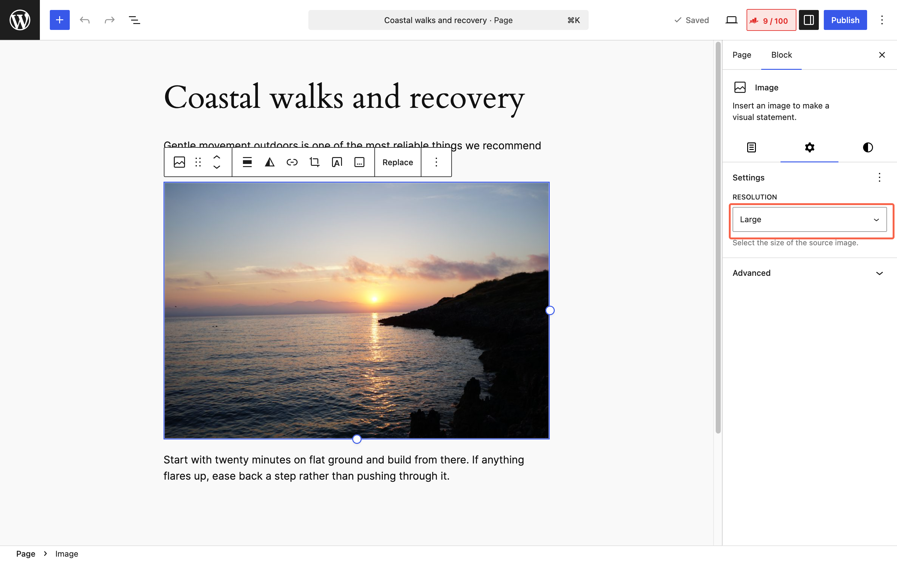
The choices are Thumbnail, Medium, Large and Full Size. Large is the sensible default and is what WordPress picks for you. Use Medium for a photo sitting in a narrow column, and Thumbnail only for something genuinely tiny. Full Size sends the largest copy on the server, and it is rarely what you want, because even on Large WordPress still offers browsers the bigger copies it made and lets each one pick the size it needs.
Check it on your phone before you move on. Load the page on a mobile and look at whether the image appears at a sensible moment or whether the page sits blank while it arrives. That is the test that matters, because it is the connection most of your visitors are on.
Find the oversized images already on your website#
Everything so far applies to the next image you add. This step is about the ones already there. In the left menu click Media, then Library, then the list icon at the top left to switch out of the grid. Now look at the file names.
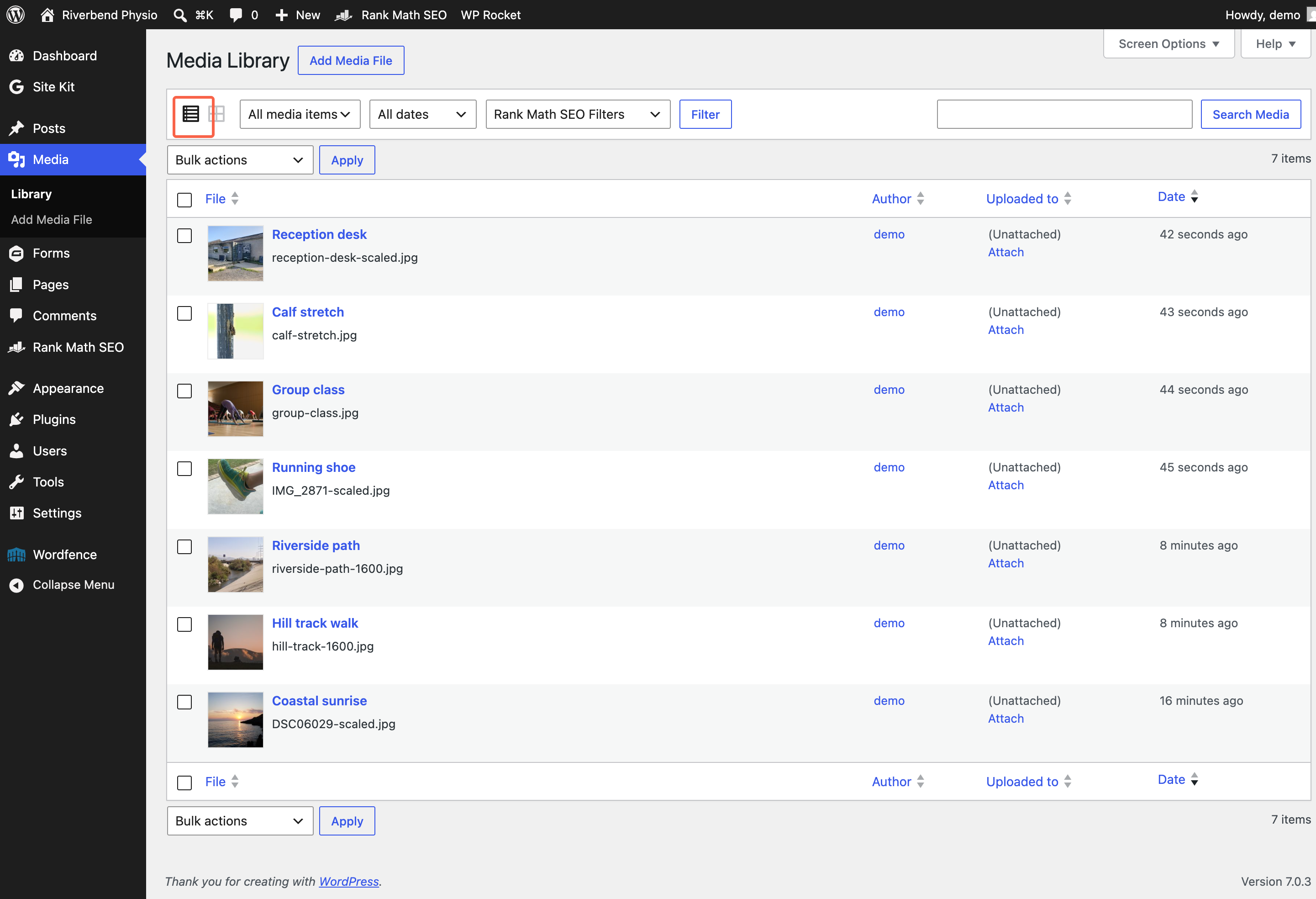
Any file name ending in -scaled was over 2560 pixels wide when it was uploaded. WordPress adds that word itself, so it is a reliable signal rather than a guess. In the list above, three of the seven images went up oversized and four did not. File names like IMG_2871 or DSC06029 are another tell, because they are what a phone or a camera calls a file before anybody renames it.
Give this fifteen minutes, not an afternoon. Click into a few of the -scaled ones, note which pages they appear on, and start with the images on your busiest pages: your home page, and whichever page people land on most. Fixing the banner on your home page is worth more than fixing thirty images nobody scrolls to. To replace one properly, resize the original following steps 3 and 4, upload the new version, swap it into the page, and only then delete the old one. Deleting a media file that is still in use leaves a broken image everywhere it appeared, and WordPress will not warn you first.
Images are usually the biggest single thing slowing a website down, but they are not the only one. If the pages are still slow after this, our guide on why a website feels slow goes through the other causes, and our guide on setting up WP Rocket covers the caching side. If you would rather not work through it yourself, our website health check is exactly this job done for you, images included.
If working back through the oversized images already on the site is not a job you want to own, we can do it for you on a WordPress care plan, which sets aside hours each quarter for exactly this sort of thing.
Tested on WordPress 7.0.3 with Rank Math 1.0.275, Gravity Forms 3.0.2, WP Rocket 3.23.1.1, Wordfence 8.2.2, 8 Sep 2026
Rather not do it yourself?
We can take this off your plate
If you would rather someone else handled the fiddly bits, that is what we are here for. Tell us what you are trying to sort out and we will point you in the right direction.
Let us give you a handWritten by