Are you ready to unlock the secret sauce to a website that wows your visitors and keeps them coming back for more? We’re talking about microinteractions—the tiny details that can make or break your user experience. Think of them as the sprinkles on your ice cream sundae; they may be small, but they add that extra bit of magic! ✨
What Are Microinteractions?
Alright, let’s keep it simple. Imagine you’re playing with a light switch. You know that satisfying click when you flick it on or off? That’s a microinteraction! They’re those little actions you see on a website, like a button changing color when you hover over it or a heart popping up when you like a post. It’s like your website is giving you a friendly high-five! ✋
Why Do Microinteractions Matter?
Microinteractions are like the friendly helpers of your website. They make sure your visitors know what’s happening and what to do next. Without them, using a website could feel like trying to solve a puzzle without any clues.
How Microinteractions Make Your Website Awesome
1. They Talk to You (Well, Almost) ️
Microinteractions give feedback. When you click a button, it changes color or makes a sound to let you know it worked. It’s like your website saying, “Yup, I got it!” This little reassurance can make users feel more confident and happy.
2. They Show You the Way
Ever wonder how some websites feel so easy to navigate? Microinteractions guide users with subtle cues. Maybe a menu item wiggles to show more options, or a progress bar fills up to show how much is left to load. It’s like having a helpful tour guide right at your fingertips! ️
3. They Add Fun and Surprise
Microinteractions can sprinkle some fun into the mix. A playful animation or a quirky loading screen can make your visitors smile. It’s these delightful moments that can turn a regular visit into a memorable one.
4. They Help Everyone Enjoy the Site ✨
Microinteractions also make websites more accessible. They use sounds and vibrations to help people with disabilities know when something important happens. It’s all about making sure everyone can enjoy your website equally!
Designing Microinteractions Like a Pro
Want to make your own microinteractions? Here’s how:
1. Keep It Simple, Silly!
Microinteractions should be like a good friend—helpful but not in your face. Keep them simple and not too flashy. The goal is to help, not to distract!
2. Make Sure They Speak Clearly
Your microinteractions should give clear feedback. Whether it’s a colorful change or a little ding, make sure users know their action was received.
3. Be Consistent
Think of microinteractions as a dance. Each step should match the next. Consistency helps users know what to expect and makes your website feel more reliable.
4. Test and Tweak
Just like trying out a new recipe, you might need to make adjustments. Test your microinteractions with real users to see what works best. Keep refining until they’re just right!
Real-Life Microinteraction Magic ✨
Let’s look at some cool examples:
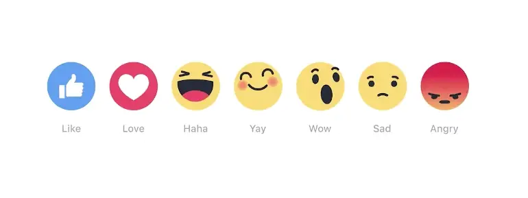
Facebook Emojis
Are you about to tell your friends how lame they were? Look at how the popup reacts with you!

Mailchimp’s Rock On!
After sending an email, Mailchimp gives you a rock on animation. It’s like they’re celebrating with you!

Google Voice Assistant
Look at how it reacts to you speaking, now if that isn’t awesome — I don’t know what is (note to self, tone down the nerd)

Small Touches, Big Wins!
Microinteractions are the little heroes of your website. They transform ordinary interactions into extraordinary experiences. By adding these tiny details, you can create a site that’s not only beautiful but also super fun and easy to use. So, go ahead and sprinkle some magic into your website design!


